MK3 Shift Knobs
- Thread starter ga70tt
- Start date
You are using an out of date browser. It may not display this or other websites correctly.
You should upgrade or use an alternative browser.
You should upgrade or use an alternative browser.
I like that revision too, but i do like the wraparound logo as well.
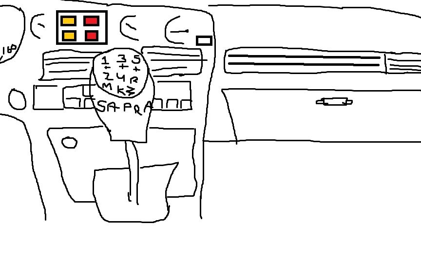
For revision 2, I might suggest placing 'Supra' in the center of the pattern in place of the horizontal line.
That way, the logo and the pattern could be slightly larger, and fill the top area better.
Besides, I already KNOW my shift pattern, I don't see myself looking down between shifts to check the diagram.
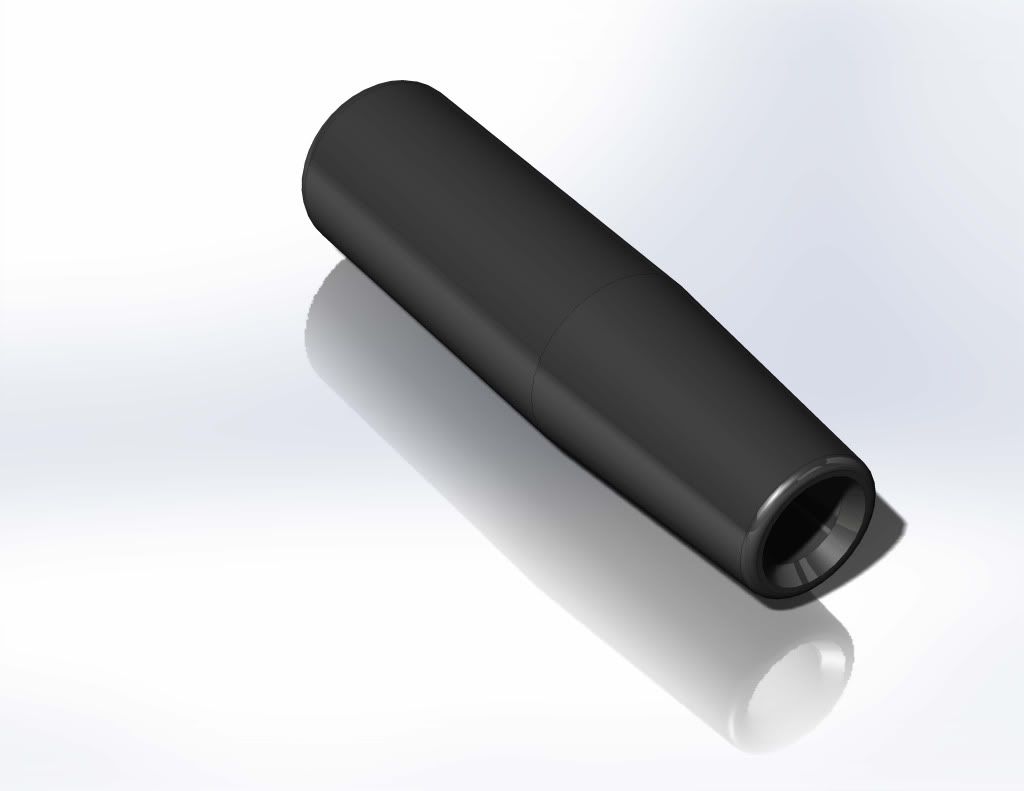
ryansmith;1897616 said:Not for many but here is my contribution, designed in solid works then machined


How do you like ergonomics of one like that? Is it comfortable?
Sent From My HTC One S using Tapatalk 2
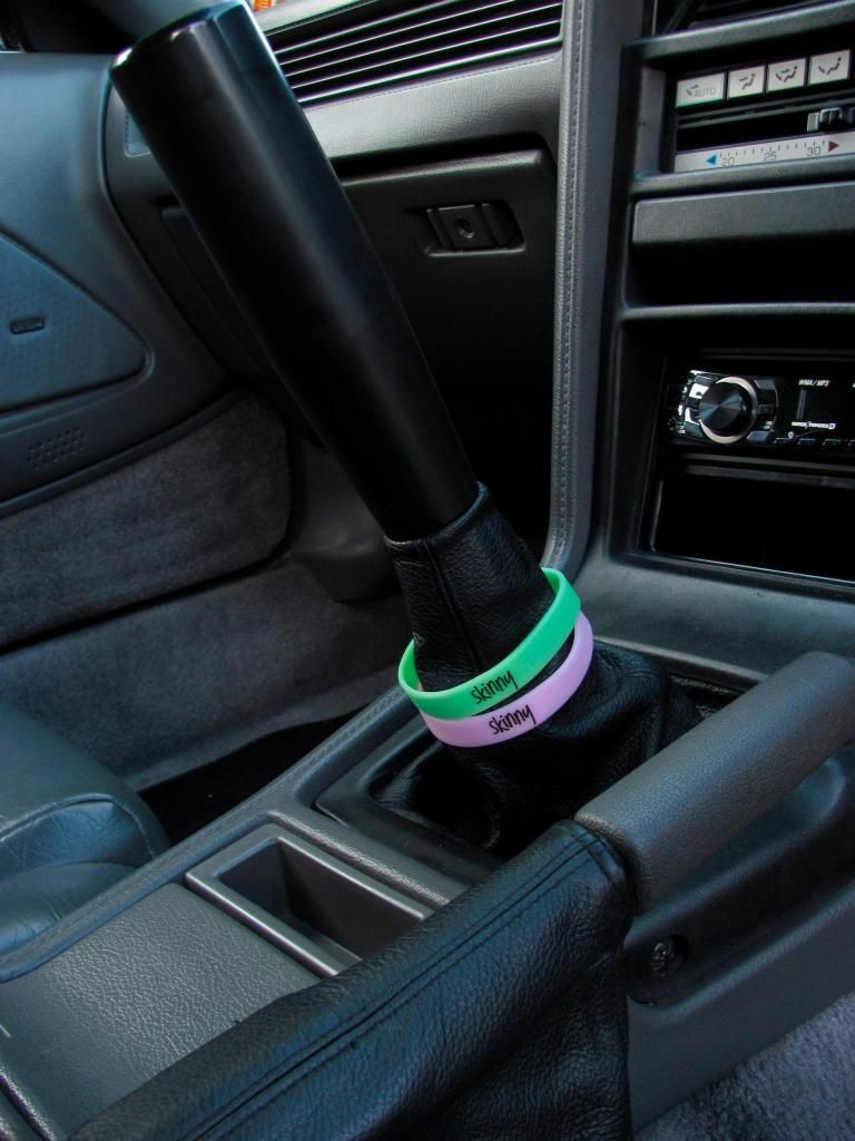
Sside;1897747 said:Here is my contribution.....

I fucking love this, I laughed so hard
Sent From My HTC One S using Tapatalk 2
BoostMonger;1897734 said:How do you like ergonomics of one like that? Is it comfortable?
Sent From My HTC One S using Tapatalk 2
I like it, your arm is level with the centre console so your not leaning forward to reach it nor holding it as if your arms raised.
Throw is nice, shifter is super light made of delrin
ryansmith;1899451 said:I like it, your arm is level with the centre console so your not leaning forward to reach it nor holding it as if your arms raised.
Throw is nice, shifter is super light made of delrin
I'm not quite sure whether or not I dig the length, but it has a really finished look to it. Nice job. Was that a one off?
Sside;1897747 said:Here is my contribution.....

seems legit, paypal ready lmk when they are available.


