
But I really like the new layout here, don't know how long it's been like this, but I really like it. Keep up the good work guys. :love: :naughty:
Might be too OT...
- Thread starter GotToyota?
- Start date
You are using an out of date browser. It may not display this or other websites correctly.
You should upgrade or use an alternative browser.
You should upgrade or use an alternative browser.
im gonna be honest here...the new layout is making me want to come here more often.
its...weird...refreshing and modern looking.
its...weird...refreshing and modern looking.
I was thinking the same. :love:Johnny Dangerously said:im gonna be honest here...the new layout is making me want to come here more often.
its...weird...refreshing and modern looking.
same here, ive noticed im posting and browsing here alot more. to be honest the reason im on sf so much is the freaking colors. there just appealing to my eyes.
I know, that's probably why everyone is here. :biglaugh:Thermactor said:boo sf is down!
Johnny Dangerously said:im gonna be honest here...the new layout is making me want to come here more often.
its...weird...refreshing and modern looking.
Yep, I like it a lot.
CTsupra
Supramania Contributor
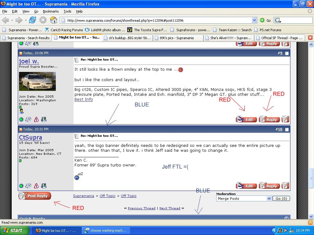
yeah, the logo banner definitely needs to be redesigned so we can actually see the entire picture up there. other than that, I love it. i think Jeff said he was going to change it.
This is the one thing I don't like about the new theme....
Come on Jeff, why can't it all be one colour? the blue doesn't look good with the red also we need more than like 4 pics up top.
Come on Jeff, why can't it all be one colour? the blue doesn't look good with the red
also we need more than like 4 pics up top.
Loki said:This is the one thing I don't like about the new theme....
Come on Jeff, why can't it all be one colour? the blue doesn't look good with the red
i LOVE the color differation...brings more life to the page.
i also LOVE the logo, its new, it has a modern look, its extremely clean and everything seems to flow very nicely. Dont change it.
CTsupra
Supramania Contributor
I had a lot more red in the original design when I uploaded it, but it didn't work. It was way too red. What's going to happen is that I'll be changing a lot of the colours so they work well together, etc, but it will not be 100% red, that just doesn't work well enough IMO.
Also, I need to update the navigation bar at the top and add in some other stuff, I hope to have it more updated in the next little while, I've been busy with a new job the past couple weeks.
Also, I need to update the navigation bar at the top and add in some other stuff, I hope to have it more updated in the next little while, I've been busy with a new job the past couple weeks.